This topic describes how to style forms created with the Rebilly Cashier Javascript library.
This process describes how to adjust the style of a form created with the Rebilly Cashier library.
You can add your stylesheet externally by including a link to the stylesheet in the head of your HTML document, or internally by adding a style tag directly to your HTML file. To learn more about structuring your CSS, see How CSS is structured.
Use a dedicated stylesheet to style your form.
To add an external stylesheet, include a link to the stylesheet in the <head> section of your HTML document. This keeps your styles separate from your HTML structure, making it easier to maintain and update your styles.
<!doctype html>
<html lang="en">
<head>
  <meta charset="UTF-8" />
  <meta name="viewport" content="width=device-width, initial-scale=1.0" />
  <link rel="stylesheet" href="path/to/your/stylesheet.css">
</head>
  <body>
  </body>
</html>To add an internal stylesheet, include a <style> tag directly in your HTML file. This keeps your styles separate from your HTML structure, making it easier to maintain and update your styles.
<!doctype html>
<html lang="en">
  <style>
    /* Form styles */
  </style>
  <body>
  </body>
</html>The Rebilly Cashier library uses CSS variables to define global form styles, such as background color, text color, and font size. Updating these variables simplifies branding adjustments.
When using CSS variables to override a Cashier library variable, ensure that both variables are defined in the same :root selector.
/* Use the root element to override the CSS variables */
:root {
  --my-primary-color: #0044d4;
  --replay-font-size: 14px;
  --replay-line-height: 20px;
  --replay-color-primary: var(--my-primary-color);
}You can also use CSS selectors to modify a specific component. For more information, see Advanced theming.
.rebilly-cashier-button {
  border-color: var(--my-button-color);
}By making adjustments to the global variables, you can customize the appearance of the experience to align with your brand.
Use Replay tokens to control typography size and spacing in cashier forms by changing the --replay-font-size variable. This value automatically updates all related font sizes and spacing adjustments.
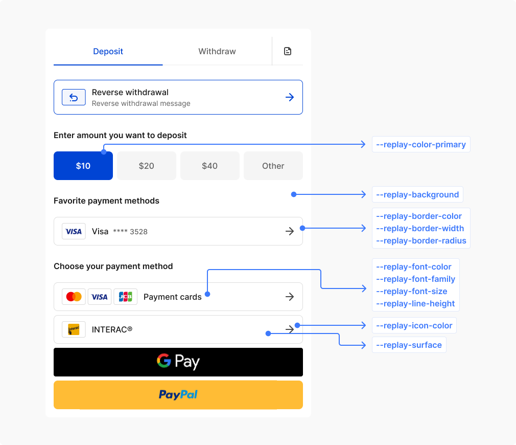
Commonly used global variables.
| CSS variable | Description | Values |
|---|---|---|
--replay-color-primary | Main brand color used for primary buttons and accents | Color |
--replay-background | Main background of the entire form container | Background |
--replay-surface | Background for elevated elements like inputs, selects, and cards | Background |
--replay-font-family | Primary font family used throughout the form | Font family |
--replay-font-size | Base font size for regular text content | Font size |
--replay-font-color | Primary text color for regular content | Color |
--replay-font-color-muted | Subdued text color for secondary information and placeholders | Color |
--replay-font-color-danger | Text color for error messages and destructive actions | Color |
--replay-font-color-info | Text color for informational messages and neutral notifications | Color |
--replay-font-color-success | Text color for success messages and positive confirmations | Color |
--replay-font-color-warning | Text color for warning messages and cautionary information | Color |
--replay-font-color-on-surface | Text color when displayed on surface backgrounds or containers | Color |
--replay-line-height | Base line height for improved text readability | Line height |
--replay-color-focus | Focus outline color for keyboard navigation and accessibility | Color |
--replay-border-color | Default border color for form elements and containers | Color |
--replay-border-color-info | Border color for informational states and notifications | Color |
--replay-border-color-success | Border color for successful states and positive feedback | Color |
--replay-border-color-danger | Border color for error states and validation failures | Color |
--replay-border-color-warning | Border color for warning states and cautionary messages | Color |
--replay-border-width | Standard border thickness used throughout the form | Border width |
--replay-border-radius | Corner rounding for form elements and containers | Border radius |
--replay-icon-color | Default color for icons and symbols throughout the form | Color |
--replay-cashier-section-gap | Spacing between each section of the layout | Length |
--replay-cashier-max-width | Maximum width constraint for the entire form layout | Width |
--replay-cashier-main-loader-size | Size of the primary loading spinner displayed during processing | Width |
--replay-selection-background | Background color for selected text | Selection background |
--replay-selection-font-color | Text color for selected text | Selection color |
For more detailed control over each element, you can reassign values to refine your branding.
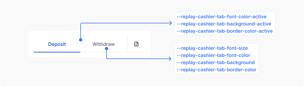
Commonly used variables for styling tabs.
| CSS variable | Description | Values |
|---|---|---|
--replay-cashier-tabs-gap | Space between tabs | Length |
--replay-cashier-tab-font-family | Font family for tab text | Font family |
--replay-cashier-tab-background | Default tab background | Background |
--replay-cashier-tab-background-hover | Tab background when mouse hovers over it | Background |
--replay-cashier-tab-font-color | Default tab text color | Color |
--replay-cashier-tab-font-color-hover | Tab text color when mouse hovers over it | Color |
--replay-cashier-tab-font-weight | Font weight for tab text | Font weight |
--replay-cashier-tab-font-size | Font size for tab text | Font size |
--replay-cashier-tab-line-height | Line height for tab text | Line height |
--replay-cashier-tab-border-width | Width of tab borders | Border width |
--replay-cashier-tab-border-style | Style of tab borders | Border style |
--replay-cashier-tab-border-color | Default tab border color | Border color |
--replay-cashier-tab-border-color-hover | Tab border color when mouse hovers over it | Border color |
--replay-cashier-tab-border-radius | Border radius for rounded tab corners | Border radius |
--replay-cashier-tab-padding | Internal spacing within tabs | Padding |
--replay-cashier-tab-background-active | Background for the currently active tab | Background |
--replay-cashier-tab-background-active-hover | Background for active tab when mouse hovers over it | Background |
--replay-cashier-tab-font-color-active | Text color for the currently active tab | Color |
--replay-cashier-tab-font-color-active-hover | Text color for active tab when mouse hovers over it | Color |
--replay-cashier-tab-border-color-active | Border color for the currently active tab | Border color |
--replay-cashier-tab-border-color-active-hover | Border color for active tab when mouse hovers over it | Border color |
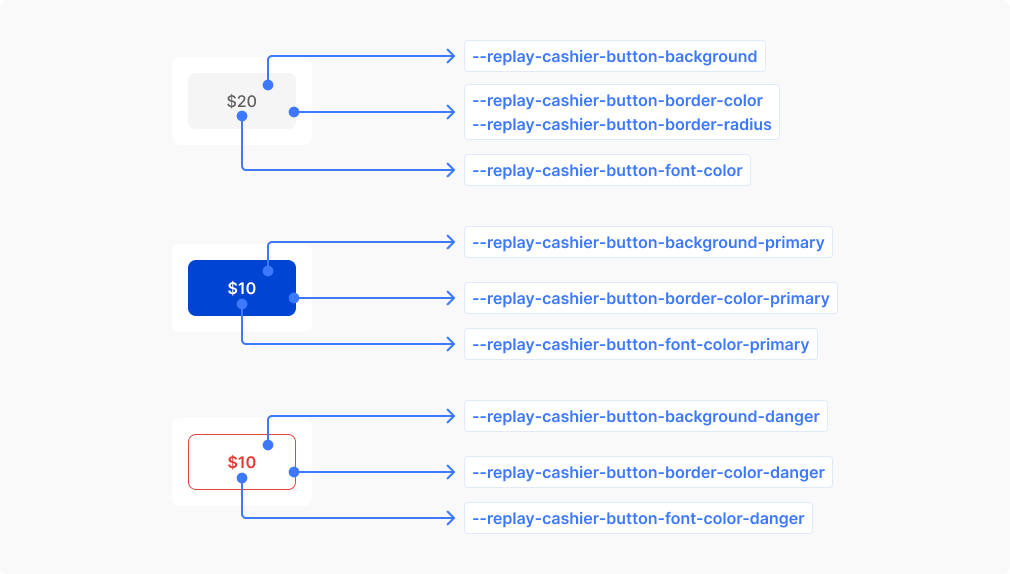
Commonly used variables for styling buttons.
| CSS variable | Description | Values |
|---|---|---|
--replay-cashier-button-background | Default button background | Background |
--replay-cashier-button-background-hover | Button background when mouse hovers over it | Background |
--replay-cashier-button-background-active | Button background when clicked or pressed | Background |
--replay-cashier-button-font-color | Default button text color | Color |
--replay-cashier-button-font-color-hover | Button text color when mouse hovers over it | Color |
--replay-cashier-button-font-color-active | Button text color when clicked or pressed | Color |
--replay-cashier-button-border-width | Thickness of button borders | Border width |
--replay-cashier-button-border-style | Style of button borders (solid, dashed, etc.) | Border style |
--replay-cashier-button-border-color | Default button border color | Border color |
--replay-cashier-button-border-color-hover | Button border color when mouse hovers over it | Border color |
--replay-cashier-button-border-color-active | Button border color when clicked or pressed | Border color |
--replay-cashier-button-font-weight | Button text thickness (normal, bold, etc.) | Font weight |
--replay-cashier-button-font-size | Size of button text | Font size |
--replay-cashier-button-line-height | Button text line spacing for vertical centering | Line height |
--replay-cashier-button-border-radius | Corner rounding for button edges | Border radius |
--replay-cashier-button-padding | Internal spacing around button text | Padding |
--replay-cashier-button-background-primary | Background for primary action buttons | Background |
--replay-cashier-button-background-primary-hover | Primary button background when hovered | Background |
--replay-cashier-button-background-primary-active | Primary button background when clicked or pressed | Background |
--replay-cashier-button-font-color-primary | Text color for primary action buttons | Color |
--replay-cashier-button-font-color-primary-hover | Primary button text color when hovered | Color |
--replay-cashier-button-font-color-primary-active | Primary button text color when clicked or pressed | Color |
--replay-cashier-button-border-color-primary | Border color for primary action buttons | Border color |
--replay-cashier-button-border-color-primary-hover | Primary button border color when hovered | Border color |
--replay-cashier-button-border-color-primary-active | Primary button border color when clicked or pressed | Border color |
--replay-cashier-button-background-danger | Background for destructive action buttons | Background |
--replay-cashier-button-background-danger-hover | Danger button background when hovered | Background |
--replay-cashier-button-background-danger-active | Danger button background when clicked or pressed | Background |
--replay-cashier-button-font-color-danger | Text color for destructive action buttons | Color |
--replay-cashier-button-font-color-danger-hover | Danger button text color when hovered | Color |
--replay-cashier-button-font-color-danger-active | Danger button text color when clicked or pressed | Color |
--replay-cashier-button-border-color-danger | Border color for destructive action buttons | Border color |
--replay-cashier-button-border-color-danger-hover | Danger button border color when hovered | Border color |
--replay-cashier-button-border-color-danger-active | Danger button border color when clicked or pressed | Border color |
--replay-cashier-button-font-size-sm | Text size for compact or small buttons | Font size |
--replay-cashier-button-line-height-sm | Line spacing for compact button text | Line height |
--replay-cashier-button-padding-sm | Reduced internal spacing for compact buttons | Padding |
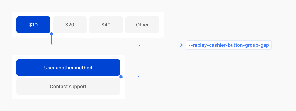
| CSS variable | Description | Values |
|---|---|---|
--replay-cashier-button-group-gap | Spacing between buttons when arranged in groups | Length |
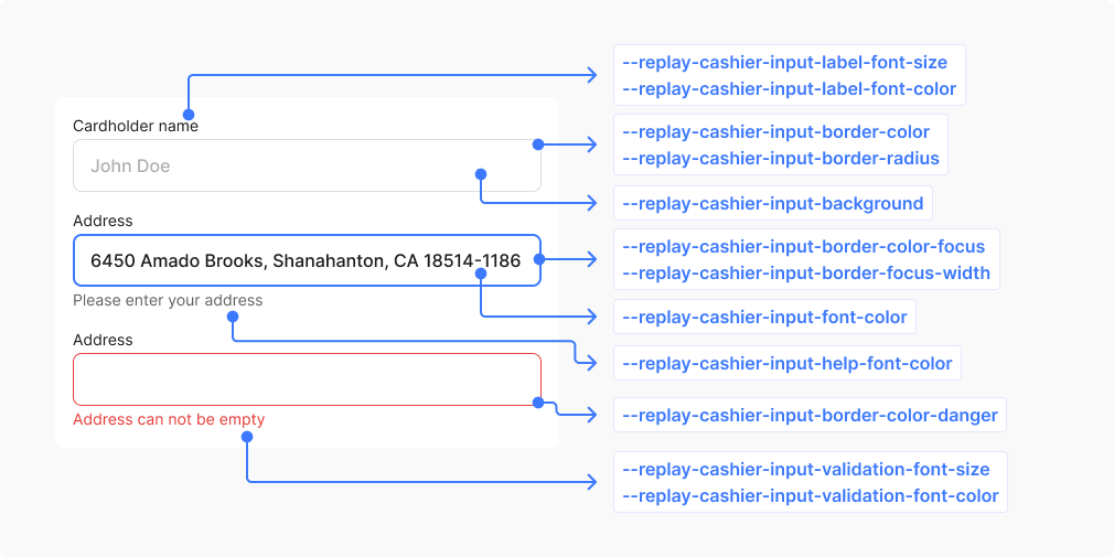
Commonly used variables for styling inputs.
| CSS variable | Description | Values |
|---|---|---|
--replay-cashier-input-label-font-color | Text color for input field labels | Color |
--replay-cashier-input-label-font-size | Font size for input field labels | Font size |
--replay-cashier-input-label-line-height | Line spacing for input field labels | Line height |
--replay-cashier-input-label-font-weight | Font weight for input field labels | Font weight |
--replay-cashier-input-placeholder-font-color | Color of placeholder text shown when input is empty | Color |
--replay-cashier-input-font-color | Color of text entered into input fields | Color |
--replay-cashier-input-font-size | Font size for text entered into input fields | Font size |
--replay-cashier-input-line-height | Line spacing for text entered into input fields | Line height |
--replay-cashier-input-font-weight | Font weight for text entered into input fields | Font weight |
--replay-cashier-input-background | Default background for input fields | Background |
--replay-cashier-input-background-disabled | Background when input field is disabled | Background |
--replay-cashier-input-background-hover | Background when mouse hovers over input field | Background |
--replay-cashier-input-background-focus | Background when input field has keyboard focus | Background |
--replay-cashier-input-border-width | Default border thickness for input fields | Border width |
--replay-cashier-input-border-focus-width | Border thickness when input field has keyboard focus | Border width |
--replay-cashier-input-border-style | Border style for input fields (solid, dashed, etc.) | Border style |
--replay-cashier-input-border-color | Default border color for input fields | Border color |
--replay-cashier-input-border-color-hover | Border color when mouse hovers over input field | Border color |
--replay-cashier-input-border-color-focus | Border color when input field has keyboard focus | Border color |
--replay-cashier-input-border-color-danger | Border color when input field has validation errors | Border color |
--replay-cashier-input-border-radius | Corner rounding for input field edges | Border radius |
--replay-cashier-input-padding | Internal spacing around text within input fields | Padding |
--replay-cashier-input-help-font-size | Font size for helpful descriptive text below inputs | Font size |
--replay-cashier-input-help-line-height | Line spacing for helpful descriptive text below inputs | Line height |
--replay-cashier-input-help-font-weight | Font weight for helpful descriptive text below inputs | Font weight |
--replay-cashier-input-help-font-color | Text color for helpful descriptive text below inputs | Color |
--replay-cashier-input-validation-font-size | Font size for error messages displayed below inputs | Font size |
--replay-cashier-input-validation-font-color | Text color for error messages displayed below inputs | Color |
--replay-cashier-input-validation-font-weight | Font weight for error messages displayed below inputs | Font weight |
--replay-cashier-input-validation-line-height | Line spacing for error messages displayed below inputs | Line height |
--replay-cashier-input-selection-background | Inputs background color for selected text | Selection background |
--replay-cashier-input-selection-font-color | Inputs text color for selected text | Selection color |
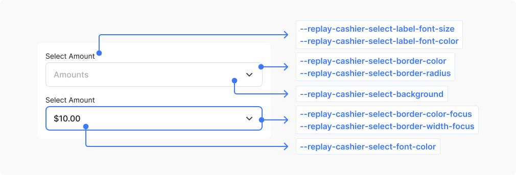
Commonly used variables for styling inputs.
| CSS variable | Description | Values |
|---|---|---|
--replay-cashier-select-label-font-color | Text color for dropdown field labels | Color |
--replay-cashier-select-label-font-size | Font size for dropdown field labels | Font size |
--replay-cashier-select-label-line-height | Line spacing for dropdown field labels | Line height |
--replay-cashier-select-label-font-weight | Font weight for dropdown field labels | Font weight |
--replay-cashier-select-font-size | Font size for selected option text in dropdown | Font size |
--replay-cashier-select-font-color | Text color for selected option text in dropdown | Color |
--replay-cashier-select-line-height | Line spacing for selected option text in dropdown | Line height |
--replay-cashier-select-font-weight | Font weight for selected option text in dropdown | Font weight |
--replay-cashier-select-padding | Internal spacing around dropdown button content | Padding |
--replay-cashier-select-background | Default background for dropdown button | Background |
--replay-cashier-select-background-disabled | Background when dropdown is disabled | Background |
--replay-cashier-select-border-width | Border thickness for dropdown button | Border width |
--replay-cashier-select-border-style | Border style for dropdown button (solid, dashed, etc.) | Border style |
--replay-cashier-select-border-color | Default border color for dropdown button | Border color |
--replay-cashier-select-border-radius | Corner rounding for dropdown button edges | Border radius |
--replay-cashier-select-background-focus | Background when dropdown has keyboard focus | Background |
--replay-cashier-select-border-color-focus | Border color when dropdown has keyboard focus | Border color |
--replay-cashier-select-border-width-focus | Border thickness when dropdown has keyboard focus | Border width |
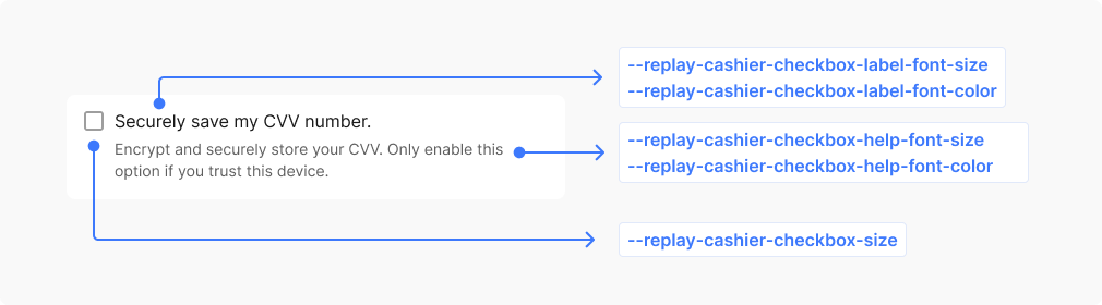
Commonly used variables for styling checkboxes.
| CSS variable | Description | Values |
|---|---|---|
--replay-cashier-checkbox-size | Width and height dimensions of the checkbox square | Size (width & height) |
--replay-cashier-checkbox-border-radius | Corner rounding for checkbox edges | Border radius |
--replay-cashier-checkbox-border-color | Border color for unchecked checkbox | Border color |
--replay-cashier-checkbox-border-width | Border thickness for checkbox square | Border width |
--replay-cashier-checkbox-background | Background for unchecked checkbox | Background |
--replay-cashier-checkbox-label-font-size | Font size for checkbox label text | Font size |
--replay-cashier-checkbox-label-font-color | Text color for checkbox label | Color |
--replay-cashier-checkbox-label-line-height | Line spacing for checkbox label text | Line height |
--replay-cashier-checkbox-label-font-weight | Font weight for checkbox label text | Font weight |
--replay-cashier-checkbox-checked-background | Background when checkbox is checked | Background |
--replay-cashier-checkbox-checked-border-color | Border color when checkbox is checked | Border color |
--replay-cashier-checkbox-checked-border-width | Border thickness when checkbox is checked | Border width |
--replay-cashier-checkbox-checked-icon-color | Color of the checkmark symbol inside checked checkbox | Color |
--replay-cashier-checkbox-checked-icon-size | Size of the checkmark symbol inside checked checkbox | Size |
--replay-cashier-checkbox-checked-icon-border-width | Stroke width of the checkmark symbol lines | Border width |
--replay-cashier-checkbox-help-font-size | Font size for helpful text below checkbox | Font size |
--replay-cashier-checkbox-help-line-height | Line spacing for helpful text below checkbox | Line height |
--replay-cashier-checkbox-help-font-color | Text color for helpful text below checkbox | Color |
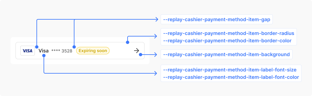
Commonly used variables for styling the payment method item.
| CSS variable | Description | Values |
|---|---|---|
--replay-cashier-payment-method-item-padding | Internal spacing around payment method option content | Padding |
--replay-cashier-payment-method-item-gap | Spacing between payment method option cards | Length |
--replay-cashier-payment-method-item-border-color | Border color for payment method option cards | Border color |
--replay-cashier-payment-method-item-border-width | Border thickness for payment method option cards | Border width |
--replay-cashier-payment-method-item-border-radius | Corner rounding for payment method option cards | Border radius |
--replay-cashier-payment-method-item-border-color-hover | Border color when hovering over payment method option | Border color |
--replay-cashier-payment-method-item-background | Background for payment method option cards | Background |
--replay-cashier-payment-method-item-background-hover | Background when hovering over payment method option | Background |
--replay-cashier-payment-method-item-label-font-size | Font size for payment method option labels | Font size |
--replay-cashier-payment-method-item-label-line-height | Line spacing for payment method option labels | Line height |
--replay-cashier-payment-method-item-label-font-weight | Font weight for payment method option labels | Font weight |
--replay-cashier-payment-method-item-label-font-color | Text color for payment method option labels | Color |
--replay-cashier-payment-method-item-label-font-color-hover | Text color when hovering the payment method option labels | Color |
--replay-cashier-payment-method-item-label-font-color-small | Text color for payment method descriptions, or caption text | Color |
--replay-cashier-payment-method-item-label-font-size-small | Font size for payment method descriptions, or caption text | Font size |
--replay-cashier-payment-method-item-label-line-height-small | Line spacing for payment method descriptions, or caption text | Line height |
--replay-cashier-payment-method-item-label-font-weight-small | Font weight for payment method descriptions, or caption text | Font weight |
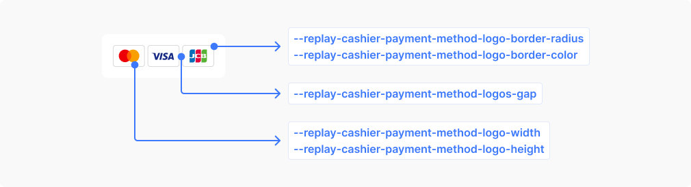
Commonly used variables for styling the payment method logo.
| CSS variable | Description | Values |
|---|---|---|
--replay-cashier-payment-method-logo-border-color | Border color for payment provider logo containers | Border color |
--replay-cashier-payment-method-logo-width | Width of individual payment provider logos | Width |
--replay-cashier-payment-method-logo-height | Height of individual payment provider logos | Height |
--replay-cashier-payment-method-logo-border-radius | Corner rounding for payment provider logo containers | Border radius |
--replay-cashier-payment-method-logos-gap | Spacing between payment provider logos in a group | Length |
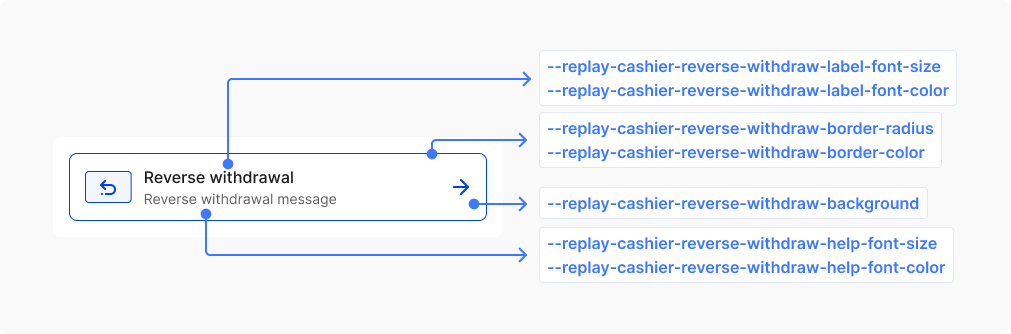
This component extends the payment method item functionality and inherits several CSS variables from the base payment method item component.
| CSS variable | Description | Values |
|---|---|---|
--replay-cashier-reverse-withdraw-background | Background color for reverse withdrawal component | Background color |
--replay-cashier-reverse-withdraw-label-font-size | Font size for reverse withdrawal text | Font size |
--replay-cashier-reverse-withdraw-label-font-weight | Font weight for reverse withdrawal text | Font weight |
--replay-cashier-reverse-withdraw-label-line-height | Line height for reverse withdrawal text | Line height |
--replay-cashier-reverse-withdraw-label-font-color | Text color for reverse withdrawal component | Color |
--replay-cashier-reverse-withdraw-border-color | Border color for reverse withdrawal component | Border color |
--replay-cashier-reverse-withdraw-border-width | Border width for reverse withdrawal component | Border width |
--replay-cashier-reverse-withdraw-border-radius | Border radius for reverse withdrawal component | Border radius |
--replay-cashier-reverse-withdraw-help-font-size | Font size for reverse withdrawal help text | Font size |
--replay-cashier-reverse-withdraw-help-font-weight | Font weight for reverse withdrawal help text | Font weight |
--replay-cashier-reverse-withdraw-help-line-height | Line height for reverse withdrawal help text | Line height |
--replay-cashier-reverse-withdraw-help-font-color | Text color for reverse withdrawal help | Color |
--replay-cashier-reverse-withdraw-icon-background | Background color for reverse withdrawal icon | Background color |
--replay-cashier-reverse-withdraw-icon-border-color | Border color for reverse withdrawal icon | Border color |
--replay-cashier-reverse-withdraw-icon-color | Color for reverse withdrawal icon | Color |
--replay-cashier-reverse-withdraw-divider-margin | Margin spacing for reverse withdrawal divider | Margin |
--replay-cashier-reverse-withdraw-background-hover | Background color for reverse withdrawal component on hover | Background color |
--replay-cashier-reverse-withdraw-border-color-hover | Border color for reverse withdrawal component on hover | Border color |
--replay-cashier-reverse-withdraw-label-font-color-hover | Text color for reverse withdrawal component on hover | Color |
--replay-cashier-reverse-withdraw-help-font-color-hover | Text color for reverse withdrawal help on hover | Color |
--replay-cashier-reverse-withdraw-icon-color-hover | Color for reverse withdrawal icon on hover | Color |
--replay-cashier-reverse-withdraw-icon-border-color-hover | Border color for reverse withdrawal icon on hover | Border color |
--replay-cashier-reverse-withdraw-icon-background-hover | Background color for reverse withdrawal icon on hover | Background color |
--replay-cashier-reverse-withdraw-background-active | Background color for reverse withdrawal component when active | Background color |
--replay-cashier-reverse-withdraw-border-color-active | Border color for reverse withdrawal component when active | Border color |
--replay-cashier-reverse-withdraw-label-font-color-active | Text color for reverse withdrawal component when active | Color |
--replay-cashier-reverse-withdraw-help-font-color-active | Text color for reverse withdrawal help when active | Color |
--replay-cashier-reverse-withdraw-icon-color-active | Color for reverse withdrawal icon when active | Color |
--replay-cashier-reverse-withdraw-icon-border-color-active | Border color for reverse withdrawal icon when active | Border color |
--replay-cashier-reverse-withdraw-icon-background-active | Background color for reverse withdrawal icon when active | Background color |
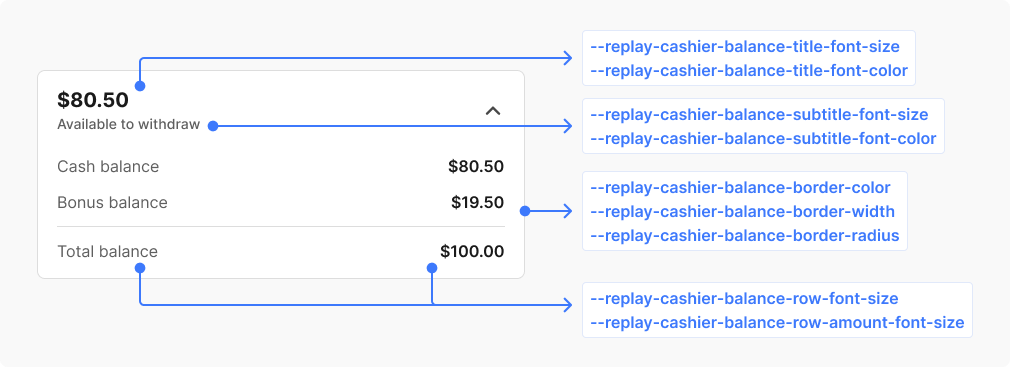
Commonly used variables for styling the balance.
| CSS variable | Description | Values |
|---|---|---|
--replay-cashier-balance-border-color | Border color for balance component | Border color |
--replay-cashier-balance-border-radius | Border radius for balance component | Border radius |
--replay-cashier-balance-border-width | Border width for balance component | Border width |
--replay-cashier-balance-title-font-size | Font size for main balance amount | Font size |
--replay-cashier-balance-title-font-color | Text color for main balance amount | Color |
--replay-cashier-balance-title-font-weight | Font weight for main balance amount | Font weight |
--replay-cashier-balance-title-line-height | Line height for main balance amount | Line height |
--replay-cashier-balance-subtitle-font-size | Font size for balance subtitle text | Font size |
--replay-cashier-balance-subtitle-font-color | Text color for balance subtitle text | Color |
--replay-cashier-balance-subtitle-line-height | Line height for balance subtitle text | Line height |
--replay-cashier-balance-subtitle-font-weight | Font weight for balance subtitle text | Font weight |
--replay-cashier-balance-row-font-size | Font size for balance breakdown labels | Font size |
--replay-cashier-balance-row-font-color | Text color for balance breakdown labels | Color |
--replay-cashier-balance-row-font-weight | Font weight for balance breakdown labels | Font weight |
--replay-cashier-balance-row-line-height | Line height for balance breakdown labels | Line height |
--replay-cashier-balance-row-amount-font-size | Font size for balance breakdown amounts | Font size |
--replay-cashier-balance-row-amount-font-color | Text color for balance breakdown amounts | Color |
--replay-cashier-balance-row-amount-font-weight | Font weight for balance breakdown amounts | Font weight |
--replay-cashier-balance-row-amount-line-height | Line height for balance breakdown amounts | Line height |
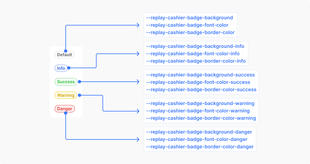
Commonly used variables for styling the badge.
| CSS variable | Description | Values |
|---|---|---|
--replay-cashier-badge-background | Default background for status badges | Background |
--replay-cashier-badge-font-color | Default text color for status badges | Color |
--replay-cashier-badge-border-color | Default border color for status badges | Border color |
--replay-cashier-badge-border-width | Border thickness for status badges | Border width |
--replay-cashier-badge-border-style | Border style for status badges (solid, dashed, etc.) | Border style |
--replay-cashier-badge-border-radius | Corner rounding for status badge edges | Border radius |
--replay-cashier-badge-padding | Internal spacing around badge text | Padding |
--replay-cashier-badge-font-size | Font size for status badge text | Font size |
--replay-cashier-badge-font-weight | Font weight for status badge text | Font weight |
--replay-cashier-badge-line-height | Line spacing for status badge text | Line height |
--replay-cashier-badge-font-family | Font family for status badge text | Font family |
--replay-cashier-badge-border-color-info | Border color for informational status badges | Border color |
--replay-cashier-badge-background-info | Background for informational status badges | Background |
--replay-cashier-badge-font-color-info | Text color for informational status badges | Color |
--replay-cashier-badge-border-color-success | Border color for success status badges | Border color |
--replay-cashier-badge-background-success | Background for success status badges | Background |
--replay-cashier-badge-font-color-success | Text color for success status badges | Color |
--replay-cashier-badge-border-color-warning | Border color for warning status badges | Border color |
--replay-cashier-badge-background-warning | Background for warning status badges | Background |
--replay-cashier-badge-font-color-warning | Text color for warning status badges | Color |
--replay-cashier-badge-border-color-danger | Border color for error/danger status badges | Border color |
--replay-cashier-badge-background-danger | Background for error/danger status badges | Background |
--replay-cashier-badge-font-color-danger | Text color for error/danger status badges | Color |
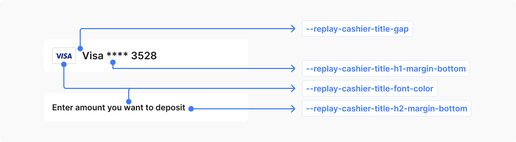
| CSS variable | Description | Values |
|---|---|---|
--replay-cashier-title-font-color | Text color for form section headings and titles | Color |
--replay-cashier-title-gap | Spacing between title elements when grouped | Length |
--replay-cashier-title-h1-margin-bottom | Bottom spacing for primary form headings (H1) | Margin |
--replay-cashier-title-h2-margin-bottom | Bottom spacing for secondary form headings (H2) | Margin |
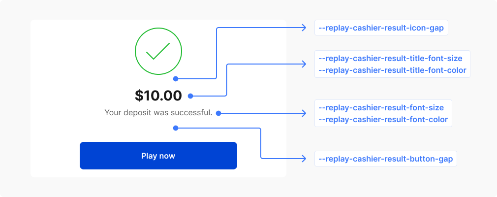
| CSS variable | Description | Values |
|---|---|---|
--replay-cashier-result-title-font-color | Text color for result page headings | Color |
--replay-cashier-result-title-font-size | Font size for result page headings | Font size |
--replay-cashier-result-title-line-height | Line spacing for result page headings | Line height |
--replay-cashier-result-title-font-weight | Font weight for result page headings | Font weight |
--replay-cashier-result-font-color | Text color for result page content | Color |
--replay-cashier-result-font-size | Font size for result page content | Font size |
--replay-cashier-result-line-height | Line spacing for result page content | Line height |
--replay-cashier-result-font-weight | Font weight for result page content | Font weight |
--replay-cashier-result-icon-gap | Spacing between icons on result pages | Length |
--replay-cashier-result-button-gap | Spacing between action buttons on result pages | Length |
--replay-cashier-result-billing-descriptor-font-color | Text color for result page billing descriptor | Color |
--replay-cashier-result-billing-descriptor-font-size | Font size for result page billing descriptor | Font size |
--replay-cashier-result-billing-descriptor-line-height | Line spacing for result page billing descriptor | Line height |
--replay-cashier-result-billing-descriptor-font-weight | Font weight for result page billing descriptor | Font weight |
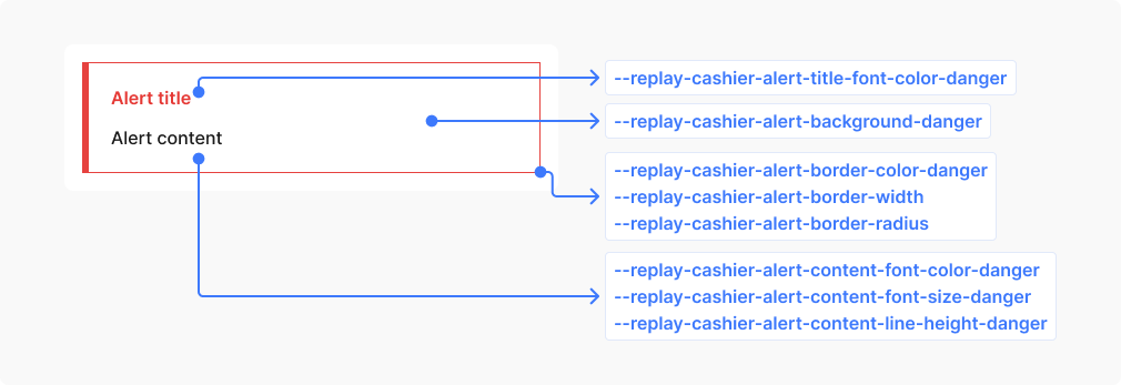
Commonly used variables for styling alerts.
| CSS variable | Description | Values |
|---|---|---|
--replay-cashier-alert-padding | Internal spacing around alert content | Padding |
--replay-cashier-alert-border-width | Border thickness for alert containers | Border width |
--replay-cashier-alert-border-radius | Corner rounding for alert container edges | Border radius |
--replay-cashier-alert-border-color | Default border color for alert containers | Border color |
--replay-cashier-alert-content-font-size | Font size for alert message text | Font size |
--replay-cashier-alert-content-line-height | Line spacing for alert message text | Line height |
--replay-cashier-alert-border-color-danger | Border color for error/danger alert containers | Border color |
--replay-cashier-alert-border-color-success | Border color for success alert containers | Border color |
--replay-cashier-alert-border-color-info | Border color for informational alert containers | Border color |
--replay-cashier-alert-border-color-warning | Border color for warning alert containers | Border color |
--replay-cashier-alert-background-danger | Background for error/danger alert containers | Background |
--replay-cashier-alert-background-success | Background for success alert containers | Background |
--replay-cashier-alert-background-info | Background for informational alert containers | Background |
--replay-cashier-alert-background-warning | Background for warning alert containers | Background |
--replay-cashier-alert-content-font-color-danger | Text color for error/danger alert content | Color |
--replay-cashier-alert-content-font-color-success | Text color for success alert content | Color |
--replay-cashier-alert-content-font-color-warning | Text color for warning alert content | Color |
--replay-cashier-alert-content-font-color-info | Text color for informational alert content | Color |
--replay-cashier-alert-title-font-color-danger | Text color for error/danger alert titles | Color |
--replay-cashier-alert-title-font-color-success | Text color for success alert titles | Color |
--replay-cashier-alert-title-font-color-warning | Text color for warning alert titles | Color |
--replay-cashier-alert-title-font-color-info | Text color for informational alert titles | Color |
To further customize the appearance of the app, you can target specific CSS selectors within the form. For instance, you can modify the styling of input elements by using the .rebilly-cashier-input CSS selector, as demonstrated in the example below:
.rebilly-cashier-input {
  color: blue;
}

.rebilly-cashier-input:hover .rebilly-cashier-input-field:hover {
  background: green;
}

.rebilly-cashier-button[disabled] {
  opacity: 0.6;
}
Replay tokens are used throughout the application, including in the cashier. If you set a global token (one without the --replay prefix), it will affect every component that uses that token. To limit your changes to just the cashier component, scope your CSS variable to the cashier only, like this:
rebilly-cashier {
  /* Only the cashier component will use this value */
  --replay-font-size: 14px;
}
This approach overrides the token for the cashier, while leaving other parts of your app unaffected.
To identify the CSS selector for an element you want to modify, use the inspector tool in your web browser. Right-click on the element and choose "Inspect" from the context menu. This action will launch the developer tools in the browser and highlight the corresponding HTML element. You can then use this selector in your custom styles to alter the appearance of the element.
To ensure a consistent and unified appearance, it is crucial to style related components when using selectors for theming. This practice helps maintain a cohesive look and prevents discrepancies in the presentation of the form.
| Element | Description | Selector |
|---|---|---|
| Deposit form | Deposit form element | .rebilly-cashier-deposit-form |
| Amount selector | Displays the available deposit amounts | .rebilly-cashier-amount-select .rebilly-cashier-amount-select-input-wrapper |
| Payment method selector | List of saved and available methods | .rebilly-cashier-payment-method-select .rebilly-cashier-choose-payment-methods |
| Button | Button selectors includes default and primary | .rebilly-cashier-button .rebilly-cashier-button-primary |
| Button group | List of buttons display in rows or columns | .rebilly-cashier-button-group |
| Input | Selectors for input elements, including labels, and fields | .rebilly-cashier-input .rebilly-cashier-input-label .rebilly-cashier-input-field |
| Select | Selectors for select elements, including labels, and fields | .rebilly-cashier-select .rebilly-cashier-select-label .rebilly-cashier-select-field |
| Payment method item | Display payment method information | .rebilly-cashier-payment-method-item .rebilly-cashier-payment-method-item-label |
| Payment method logo | Payment method logo container | .rebilly-cashier-payment-method-logos .rebilly-cashier-payment-method-logo |
| Title | Title headings | .rebilly-cashier-title |
| Icons | Selectors related to SVG icons | .rebilly-cashier-icon .rebilly-cashier-icon.rebilly-cashier-icon-color |
Modifier styles in CSS are used to apply additional styling to specific states of a component.
| Modifier | Description | Selector |
|---|---|---|
.rebilly-cashier-is-disabled | Disable state | .rebilly-cashier-payment-method-item |
.rebilly-cashier-is-loading | Loading state | .rebilly-deposit-form .rebilly-cashier-payment-method-item |